Stanfords Coffee House Case Study.
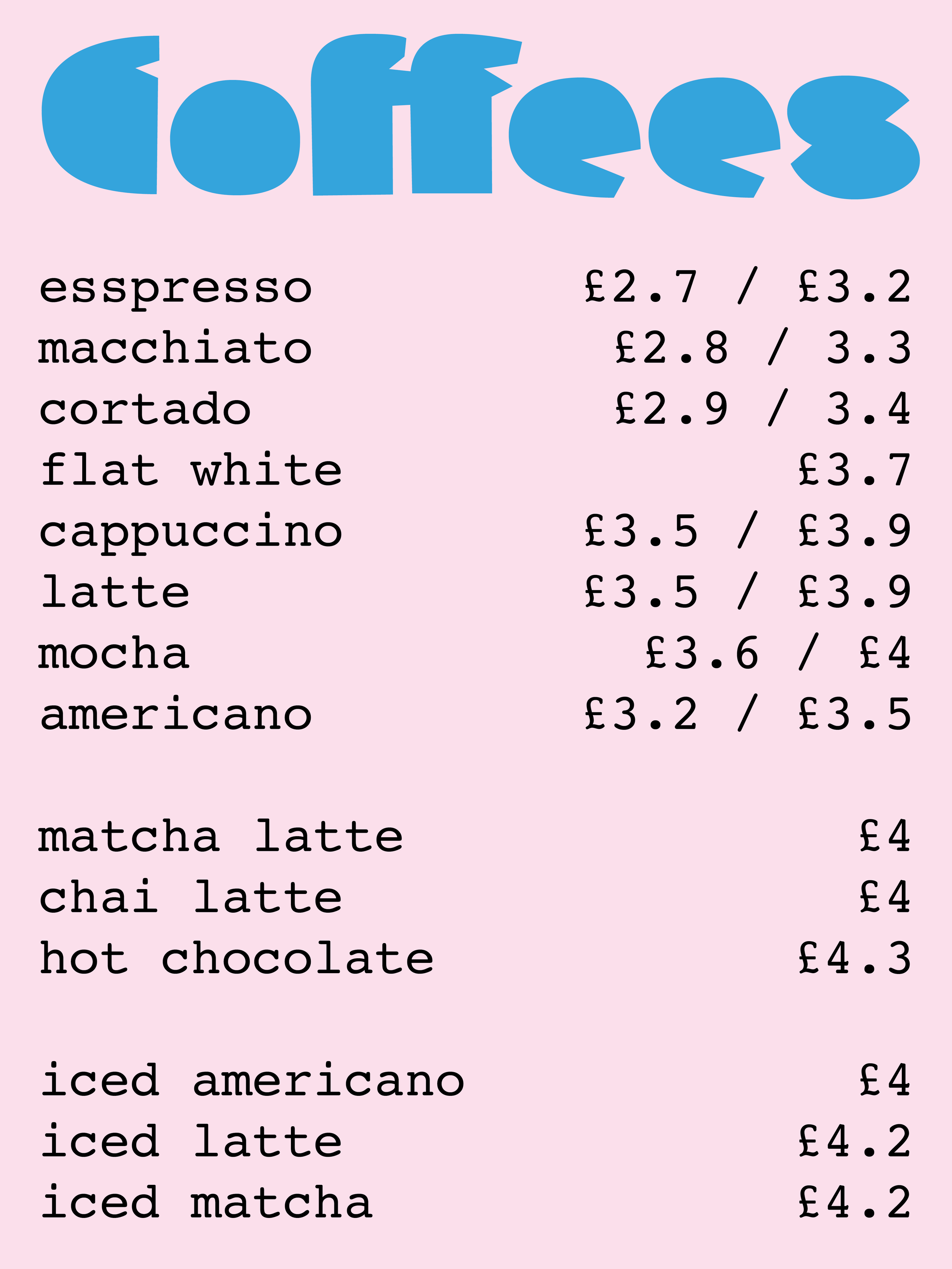
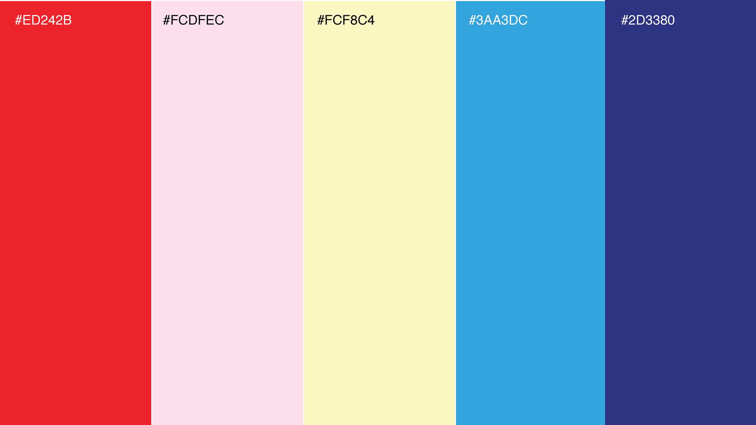
Stanford's Coffeehouse needed a rebrand that could do two things at once, stay true to the traditional aesthetic of Stanford's Bookstore while speaking to a more contemporary audience. I delivered a full visual identity, including logo, colour palette, and signage, along with menu design for their coffee and pastry range. The outcome sits comfortably between heritage and modernity, familiar enough to feel trustworthy, current enough to feel fresh.
Deliverables
Logo, Colour palette, Typography system & Signage.

Iconography
The icons chosen for Stanford's Coffee House have been selected for their timeless, classical quality. For our older audience, they offer instant recognisability, familiar visual cues that feel considered and trustworthy. For younger customers, the same icons carry a sense of nostalgia, tapping into an appreciation for heritage aesthetics and the growing appeal of retro-influenced design.
Colour Palette
Typography
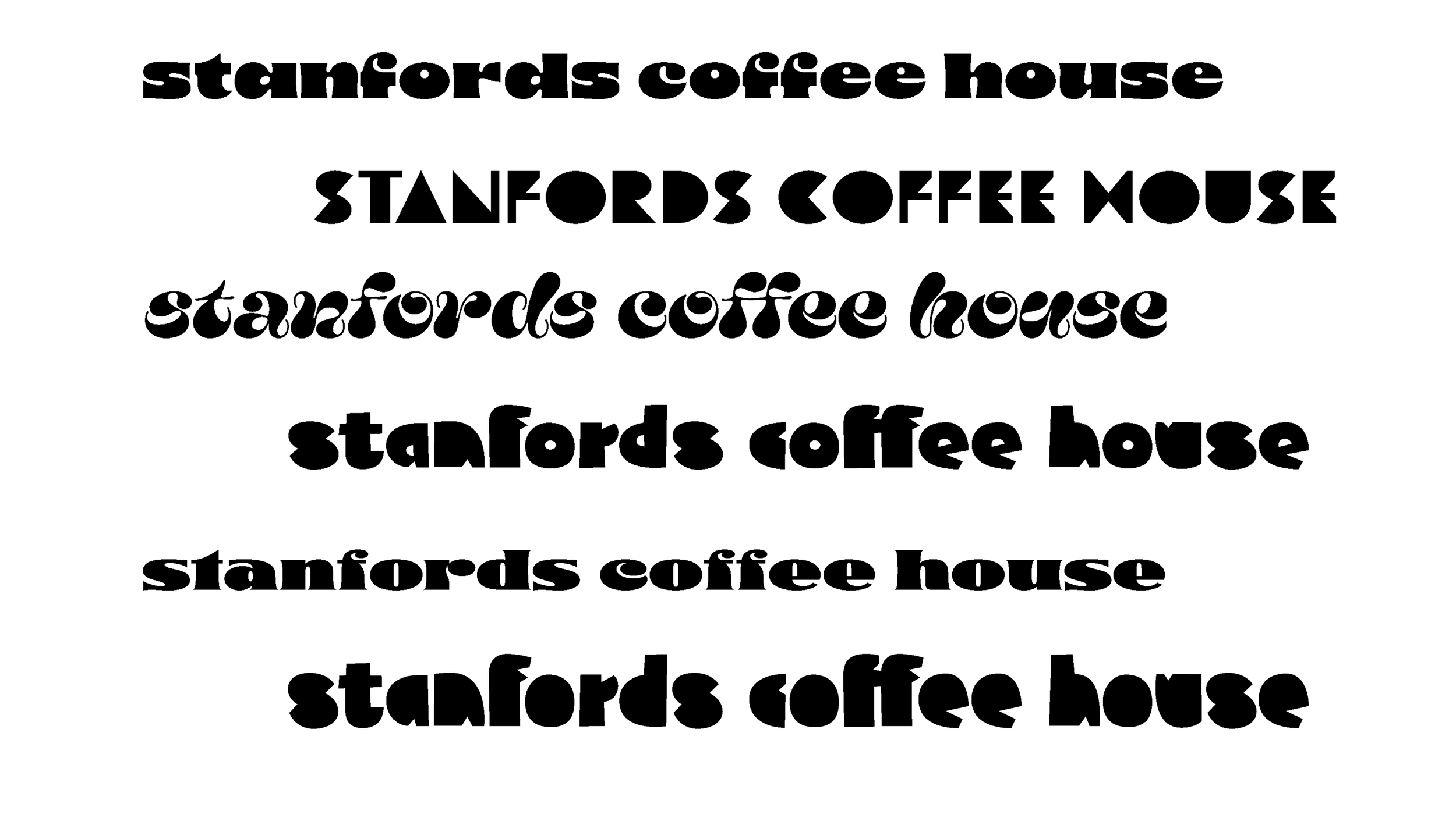
The typefaces explored for Stanford's were chosen to reflect the mood and character of the space. Drawing inspiration from Art Deco and retro typographic traditions, the goal was to strike a balance between visual artistry and clean legibility, letterforms that feel distinctive without sacrificing clarity.