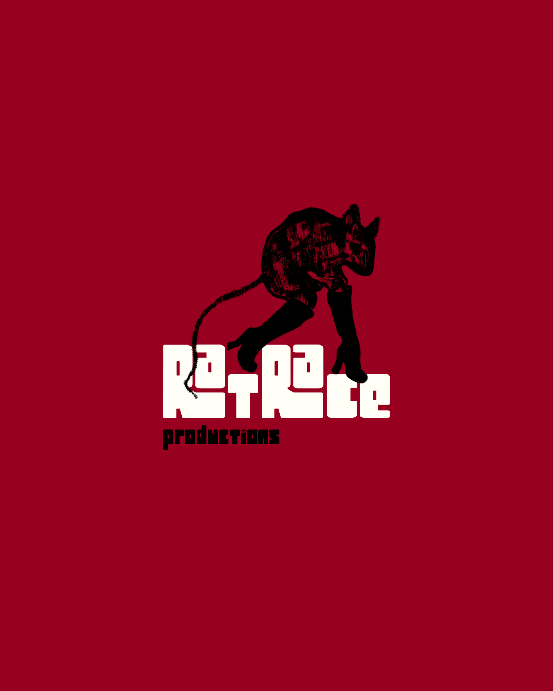
RatRace Productions Case Study.
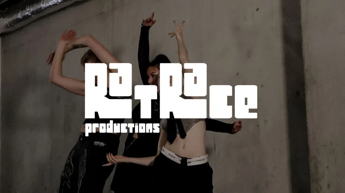
RatRace needed a visual identity that could speak directly to a young, creative audience; one that felt culturally credible enough to attract serious artists, managers, and producers, while reflecting the multidisciplinary nature of the company and its founders.
Deliverables
Logo & brand mark, Colour palette, Typography system, Iconography & Website design.
Research
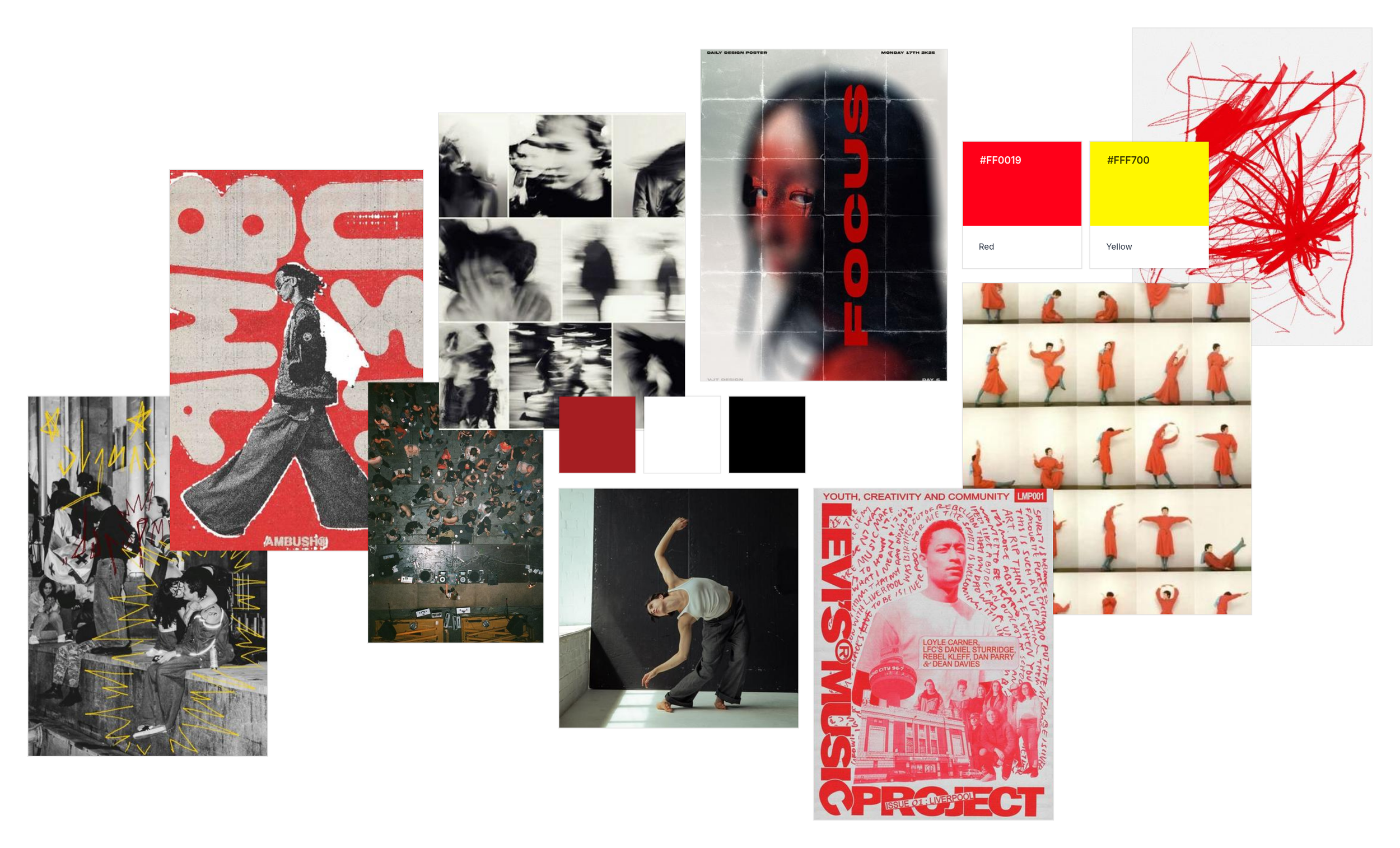
Research drew from the visual culture surrounding independent music — zines, club nights, music press, and artist-led brands.
Colour Palette
Typography
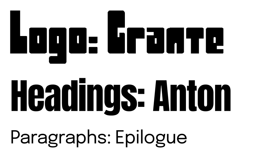
The typefaces chosen for RatRace were selected to reflect the energy and character of the brand. Drawing from Art Deco and retro typographic traditions, the goal was to strike a balance between visual artistry and clean legibility, letterforms that feel distinctive without sacrificing clarity.

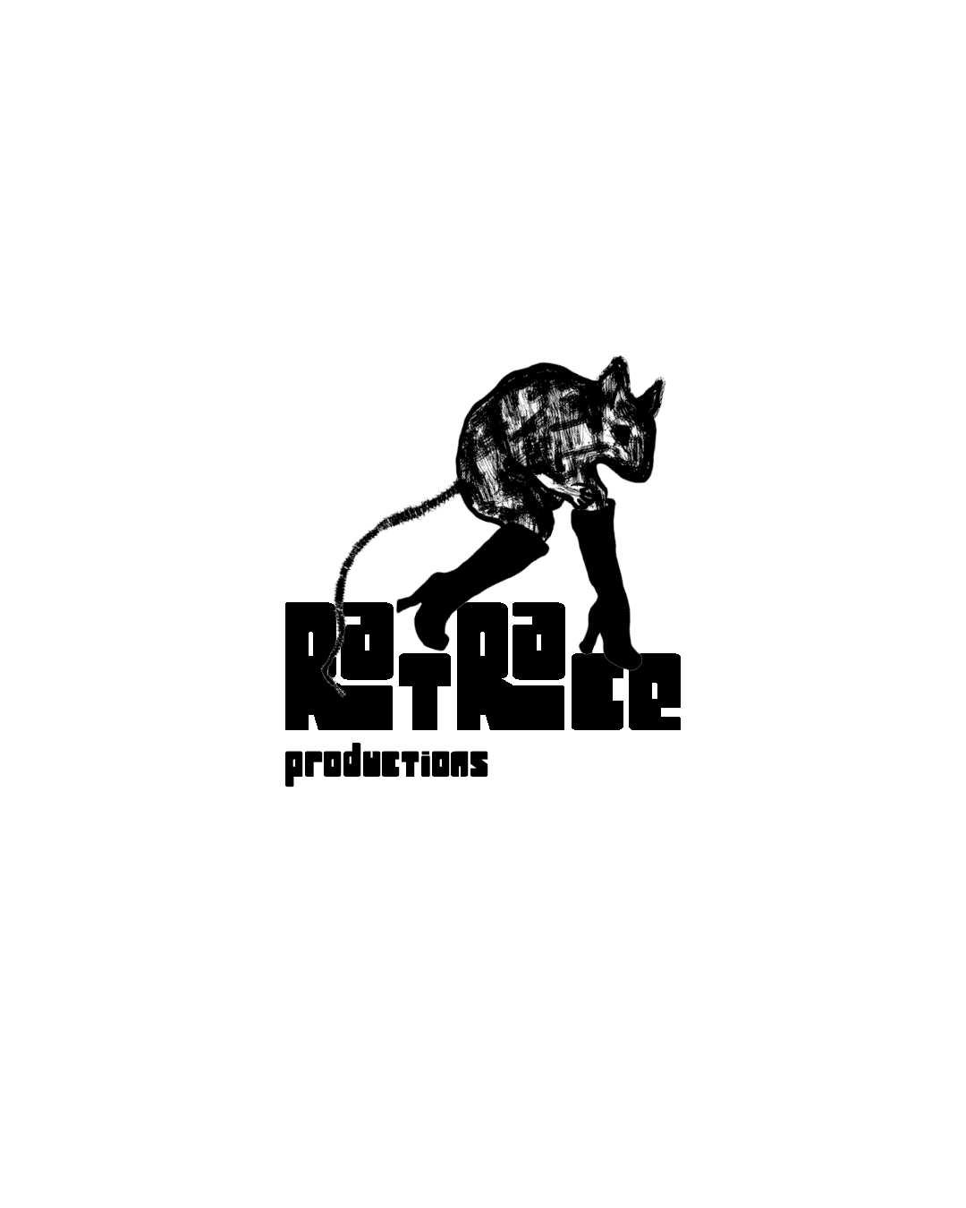
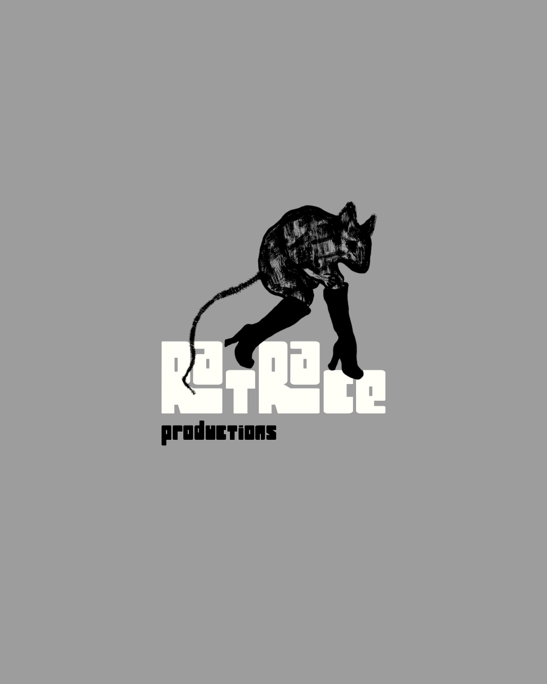
The mark was designed to feel bold and immediately readable — enough character to stand alone, without needing supporting elements to carry it. Explorations moved between type-led and mark-led directions before landing on a solution that works across all scales and applications.