Factor Barcelona Case Study.
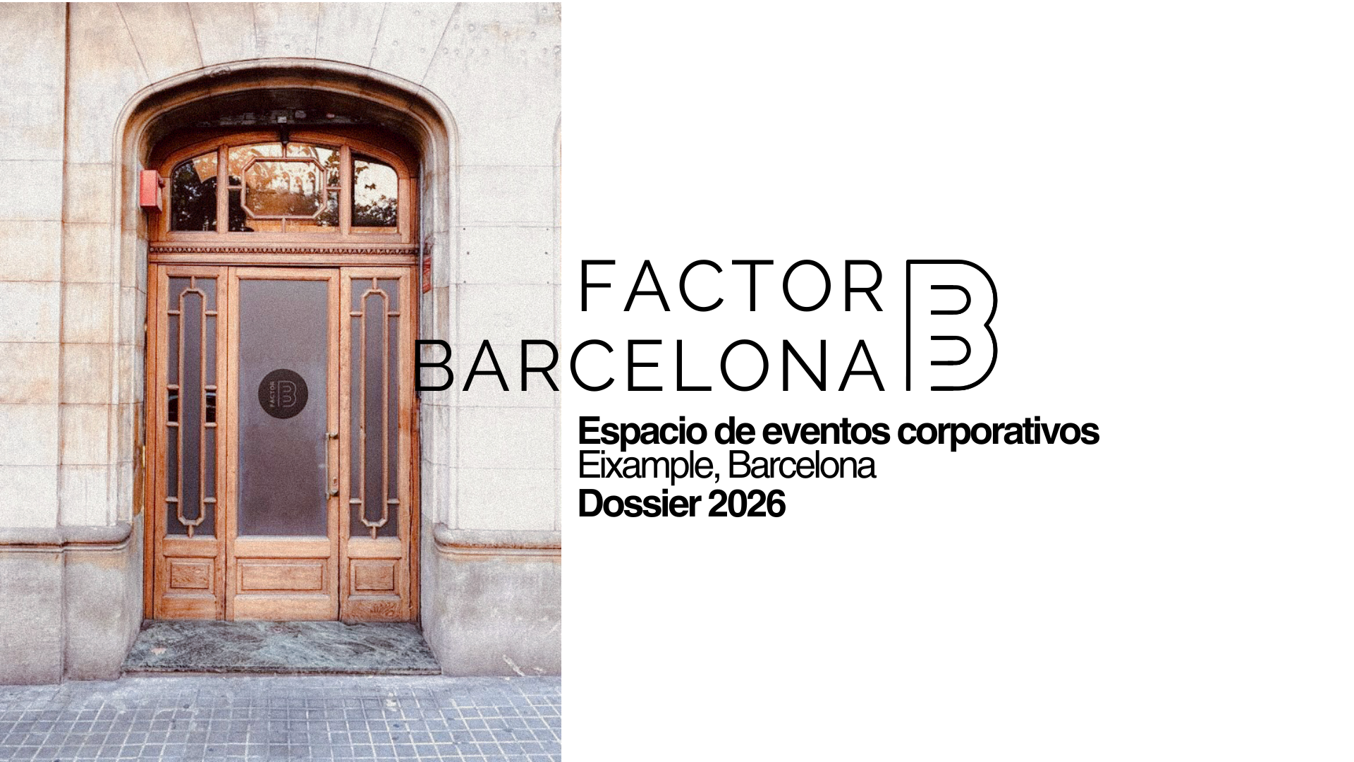
Factor Barcelona came to me with a specific problem, their existing brochure had grown outdated and no longer reflected the brand they had become. This was not a brochure designed to spark initial interest, it was going to prospective clients who were already close to booking, so the pressure was on clarity and polish rather than persuasion from scratch. I worked from a mix of provided venue and equipment photography and imagery I sourced myself to fill the gaps, alongside textures that helped tie the whole piece together visually. Rather than starting from zero, I built on their established brand elements, elevating the layout and overall presentation so the brochure could finally match the quality of the events it was selling.
Deliverables
Digital brochure, image sourcing, texture sourcing, layout design, brand application
Atmosphere
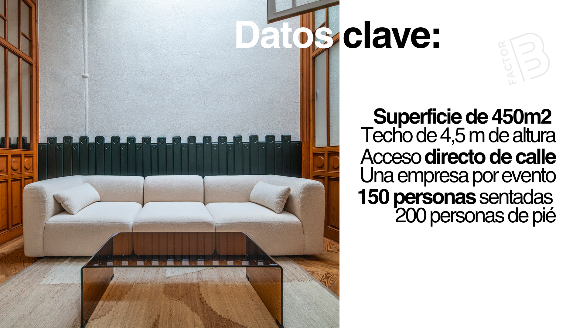
The goal was to create sleek lines and a chic, classy atmosphere. I used clean, minimal fonts and experimented with how the words were read, finding ways to draw attention to something in a calm, considered manner.
Consistency
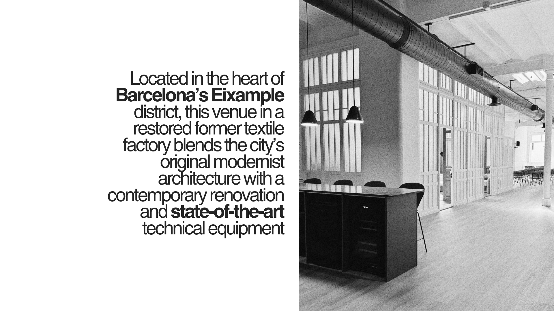
There was a lot of imagery to go through, and I wanted to make sure each image shared something with the ones before it, whether that was through colour, mood, or content. There needed to be a consistent thread running through the pages.
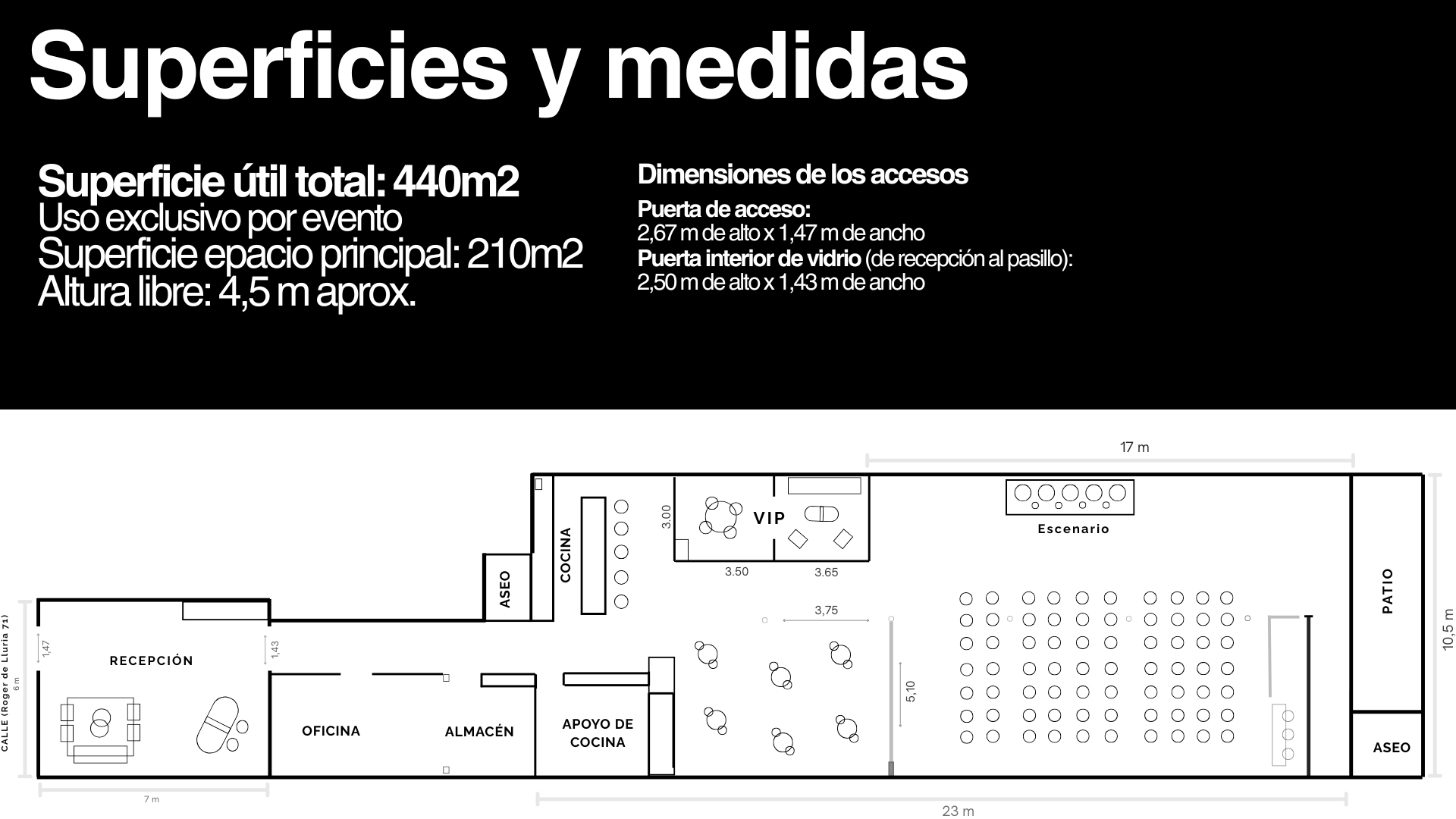
Informative but clean
There was a lot of information that needed to go into the brochure, but it still needed to feel short and visually uncluttered, not overwhelming to read.